
What is data visualization?
“A picture is worth a thousand words.”
I’m 100% sure that this isn’t the first time you’re hearing this. If you agree, it only means that there’s not a lot of convincing for us to do in this article, so we’ll quickly cover the basics and move on to how you can actually use data visualization for your nonprofit organization. However, here’s a small exercise for those that need convincing.
Please find the month that NGOX achieved maximum donations:
Option 1 – data in text
NGOX achieved $10800 in Jan
NGOX achieved $5400 in Feb
NGOX achieved $3789 in March
NGOX achieved $15632 in April
Option 2 – a visual representation
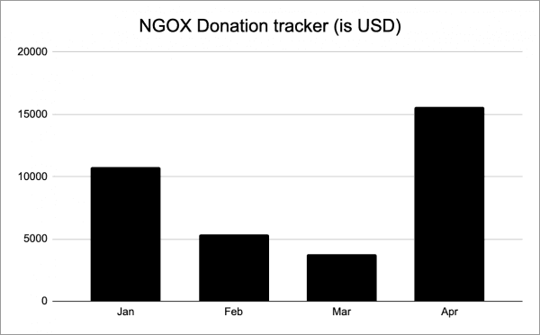
Wasn’t option 2 so much easier? Using visualization helps decipher and effectively communicate even complex data.
That established, here’s a quick way to remember what it can do to your NPO:
Data visualization = (simple + effective) communication
How does data visualization help NPOs in particular?
Simply put, data visualization helps nonprofits effectively communicate the impact of the organization’s efforts and their reaps to respective stakeholders. For example:
- For donors – A nonprofit can use visualization tools to narrate the research findings that led to your nonprofit picking up the cause, the number of people positively affected by your organization’s efforts, geographies your NPO has its presence in, and more.
- For the organization itself – Besides communicating to potential donors, data visualization has many benefits that can help your NPO flourish. Visualization tools help people understand the progress of the organization so far and what efforts have worked and what hasn’t to arrive at insights easily in order to be able to make better informed data-driven decisions.
The only 2 things you have to keep in mind while adopting data visualization strategies in your organization is to keep it simple and visually appealing.
- Keep it simple – Make sure the visuals you arrive at are easy to understand for the reader. If it helps, you could also add a line of text below your visual to state the inference of the visual or the message you want the reader to interpret. Just make sure to limit the text to a line or two max.
- Follow your brand guidelines – It’s important to establish a brand connection in the minds of the readers — this leads to better retention of your overall branding efforts. Having consistent visuals across all communication helps your brand get its recognition and acts as an important differentiator to make your brand stand out from the rest.
Given the numerous benefits there is with respect to incorporating data visualization as a mode of communication and covering the basics of effective visualization, let us now look at identifying the different types of data formats and their use cases in a nonprofit setting.
Different types of data visualization and how it can be used for your NPO
Charts
The pie, bar, column, and line are the easiest charts, to begin with, that can help visualize simple data such as funds collected over the months, distribution of funds, content that worked to raise funds, etc. Eventually, when you move on to visualizing more complex data with dedicated resources in-house, you could also look at area charts, scatter plot charts, and radar charts, depending on the kind of data that is available. These types of charts could representation of the lives touched by your nonprofit’s efforts, the emotions associated with your brand terms, and more.
Maps
A visual representation of a map can be the easiest way to show the locations your organization operates in or has an impact over. You can use different coloring to show information such as physical locations of the NPO, areas of impact, and so on.

Infographics
This is a great way to present facts to your audience. You can use infographics to visually represent your research findings, the pain points you are trying to address with your efforts, what is expected of the donors, and more all in 1 visual. This may be a great style for your newsletters as well.
Dashboards
Dashboards help track multiple metrics in a single view. For example, when you can log in to your Google Analytics or Facebook Ads Manager, you’ll see all the different metrics associated with your website and social media channels respectively, tracking things like traffic, engagement, bounce rate, pages navigated, etc. Depending on the nature of information, you can create a dashboard for every function within your organization (sales, marketing, HR, etc.).
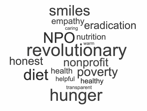
Word Cloud
A word cloud is a visual representation of words that highlight popular words associated with your brand. For instance, the word cloud for a nonprofit that provides food for the underprivileged would look something like this:
While we have covered the basic types in this article, there are many more types of data visualization tools that you can use depending on the data you have and the information that needs to be drawn. Data visualization helps your organization with quick and simple visual insights that can lead to more in-depth analyses and better-informed decision-making.


 4 Ways to Boost Your Email Subscribers